Some of these cookies are essential for site functionality, while others help us to improve your experience by providing insights into how the site is being used.
For more detailed information on the cookies we use, please check our Privacy Policy
Accept
BUY MORE, SAVE MORE: 10% OFF $500+ | 12% OFF $1,000+ | 15% OFF $2,000+
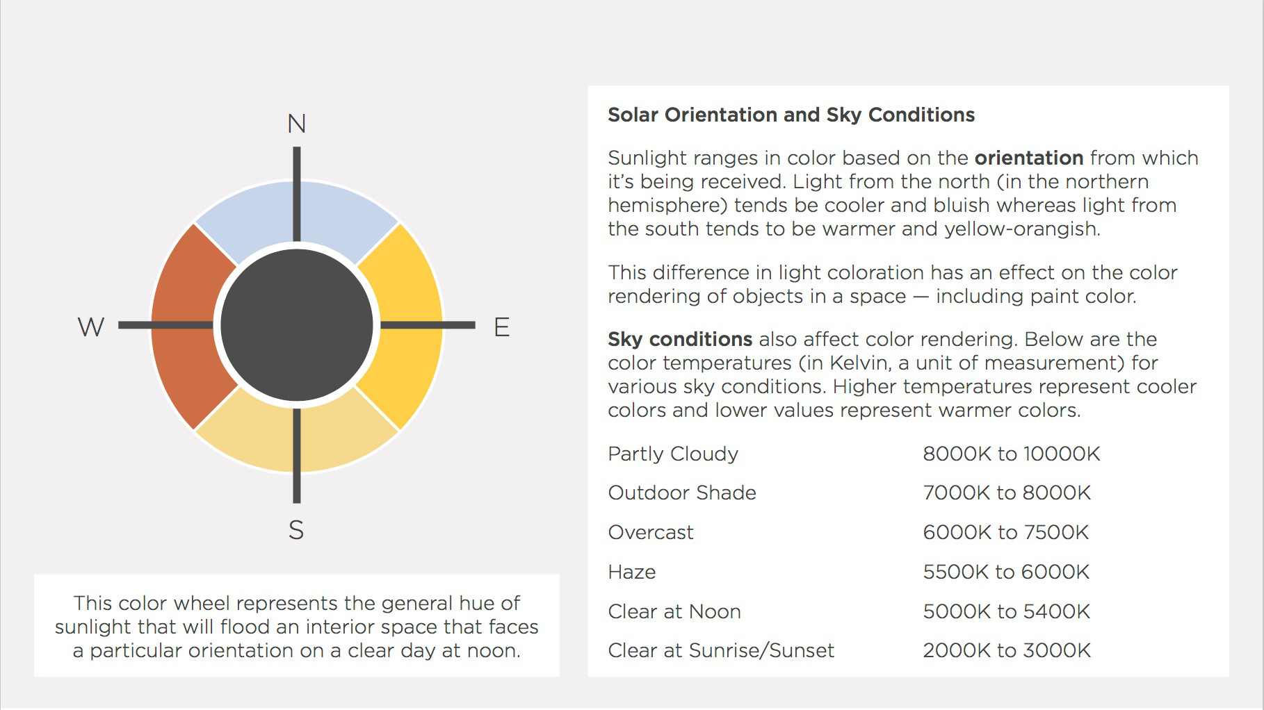
Color Rendering | Solar Orientation and Sky Conditions
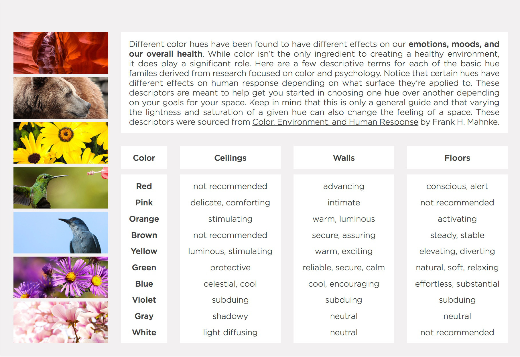
Color and Human Response
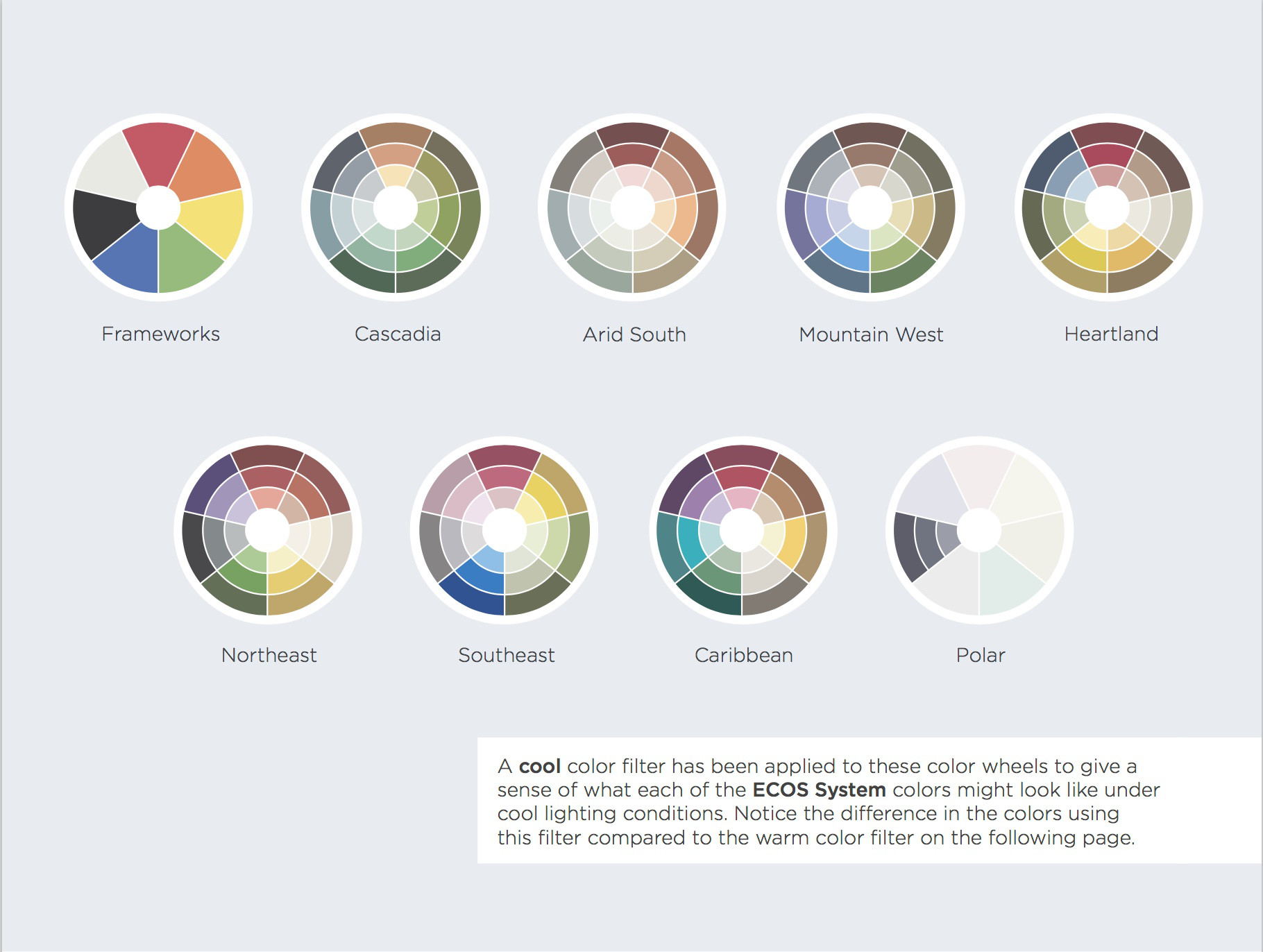
Color Rendering | Cool Light (6000K to 10000K)
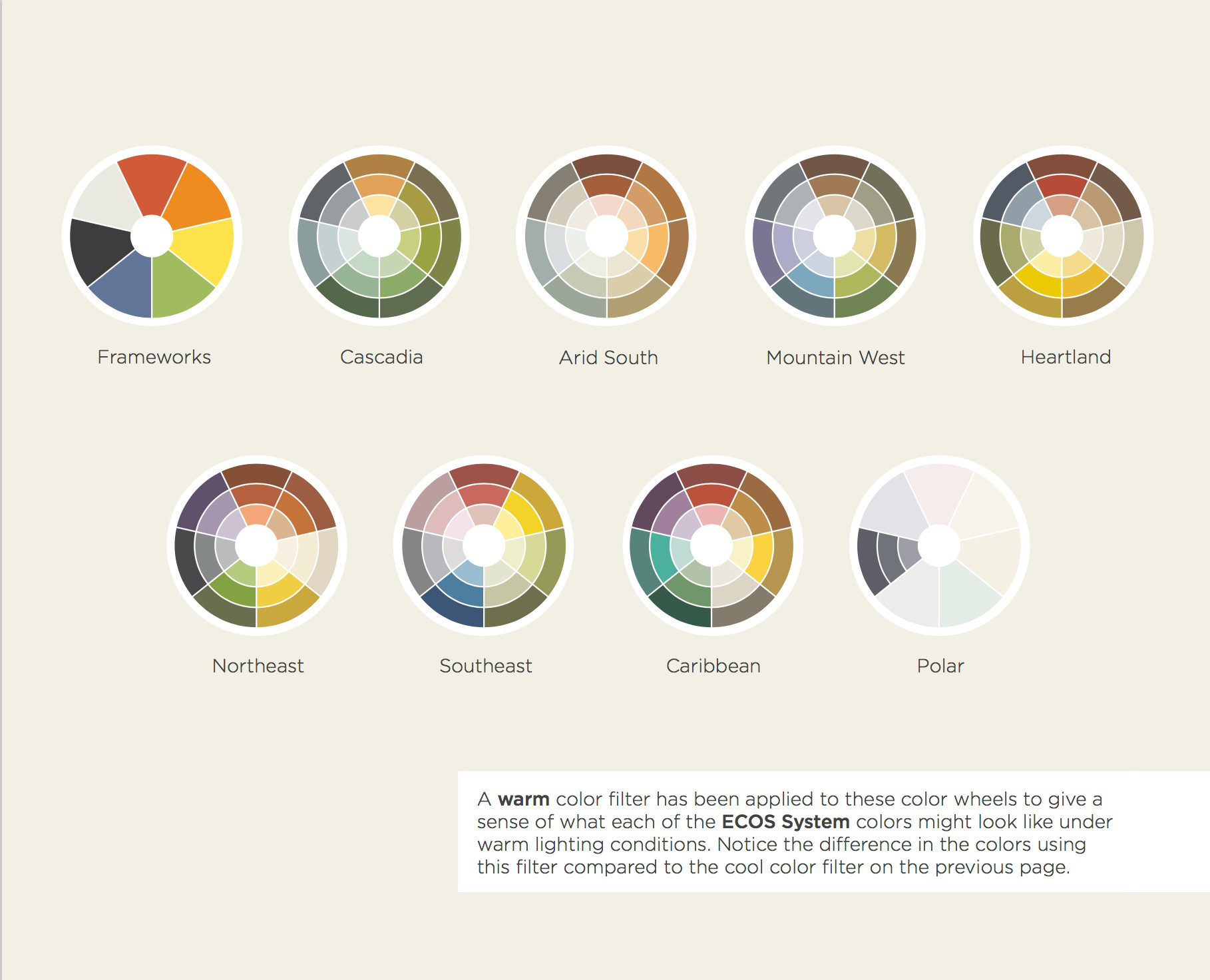
Color Rendering | Warm Light (1500K to 3000K)
Glossary of Terms
Select your product:
Order A Color Match
Already have a favorite paint color from another brand? Found the perfect color chip in your local store? Send us the details and we'll match it for free. Enter the details below, then select your product and quantity. We’ll take care of the rest!
1) Enter your color details
MORE INFORMATION
Samples should be at least 2” x 3” painted sample (2 coats) or a manufacturer’s color card to us at the address below. Include your name, email address, phone number and ECOS order number.
Imperial Paints LLC
Attn: Color Matching Department
PO Box 489
Fairforest, SC 29336
2) Select your paint finish
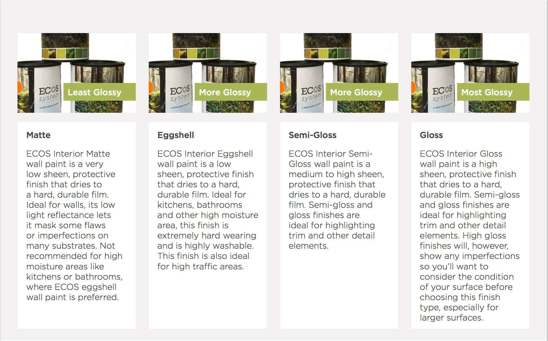
Matte Paint
Eggshell Paint
Semi-Gloss Paint
Gloss Paint
View more products
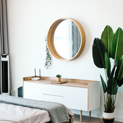
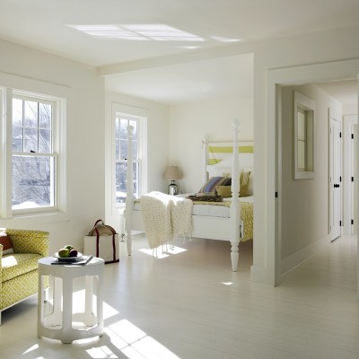
Exterior Paints
Exterior Satin Wall Paint
Exterior Vinyl Siding Paint
Exterior Low-Lustre Wall Paint
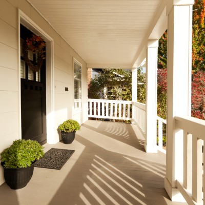
Exterior Porch & Floor Paint
Specialty & Floor Paints
Air Purifying Paint
Anti-Formaldehyde Paint
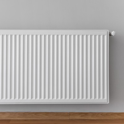
Anti-Formaldehyde Radiator (AFR) Paint
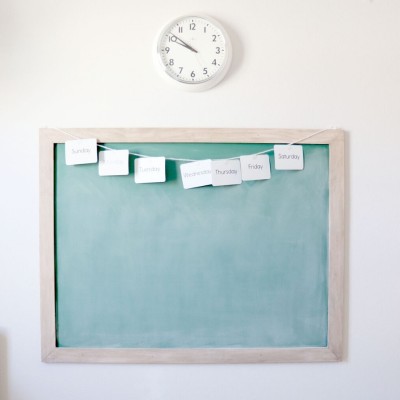
Chalkboard Paint
Radiator Paint
Feng Shui Paint
Interior Floor Paint
Interior Anti-Slip Floor Paint
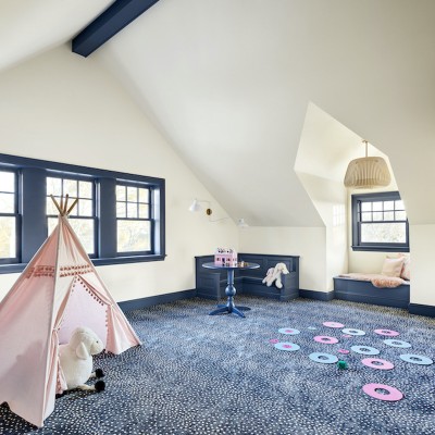
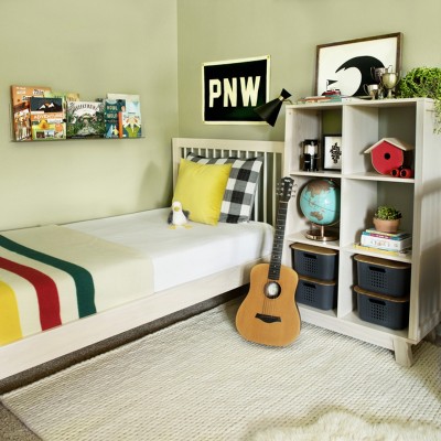
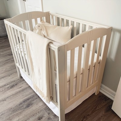
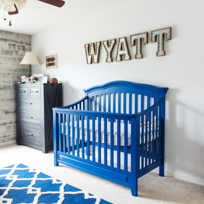
Lullaby Paints
Lullaby Matte Paint
Lullaby Eggshell Paint
Lullaby Semi-Gloss Paint
Lullaby Gloss Paint
Pet Dwellings Paints
Eggshell Pet Dwellings Paint
Semi-Gloss Pet Dwellings Paint
Gloss Pet Dwellings Paint
Purchase Paint
Select your paint finish
Matte Paint
Eggshell Paint
Semi-Gloss Paint
Gloss Paint
View more products
Exterior Paints
Exterior Satin Wall Paint
Exterior Vinyl Siding Paint
Exterior Low-Lustre Wall Paint
Exterior Porch & Floor Paint
Specialty & Floor Paints
Air Purifying Paint
Anti-Formaldehyde Paint
Anti-Formaldehyde Radiator (AFR) Paint
Chalkboard Paint
Radiator Paint
Feng Shui Paint
Interior Floor Paint
Interior Anti-Slip Floor Paint
Lullaby Paints
Lullaby Matte Paint
Lullaby Eggshell Paint
Lullaby Semi-Gloss Paint
Lullaby Gloss Paint
Pet Dwellings Paints
Eggshell Pet Dwellings Paint
Semi-Gloss Pet Dwellings Paint
Gloss Pet Dwellings Paint
Calculate Coverage
Loading...
Select a product below to estimate the quantity to purchase: